Project Description
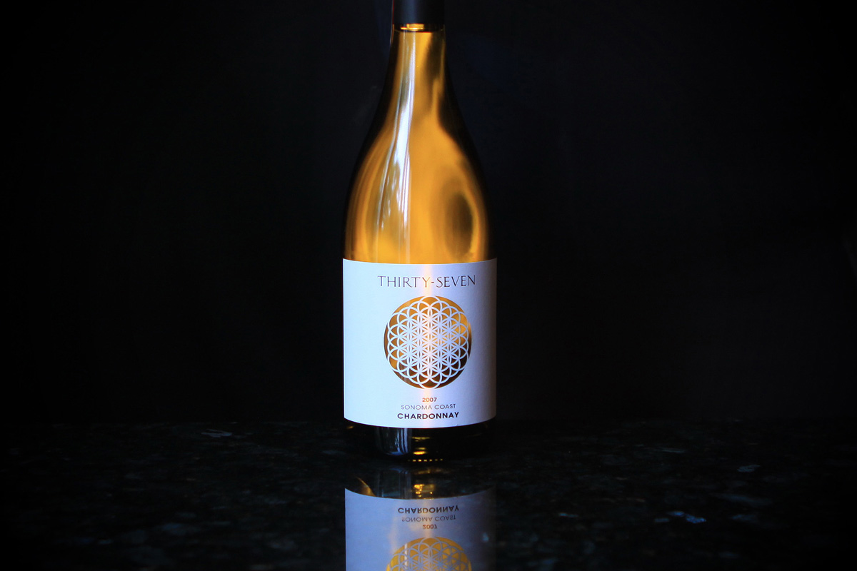
Thirty-seven interlocking circles create the Flower of Life, and ancient representation of the interconnectivity between all living things and the inherent balance of nature. We chose this icon to represent our winery because we and our wines are inexorably linked to all that surrounds us.
For this brand we started from scratch to create a name, label concept and brand identity. We started by interviewing the owner, then brainstorming and researching concepts and names until we found the perfect fit for the project. The vineyards and future winery are at the intersection of Highways 37 and 121 in the Sears Point area of the Sonoma Coast Appellation, but the Thirty-Seven name and logo come from the concept of the Flower of Life created with 37 concentric circles and using the concepts of the symmetry, proportion, and harmony in nature. These concepts perfectly compliment the owner’s belief in sustainably farmed vineyards and plans for an environmentally built winery. We worked with label designer Ellen Riendeau of Soda Rock Studios to create this unique, laser die-cut label to showcase the logo most effectively.